COUTURE
The Quiet Side of Opulence: Reading a Couture Look in Close-Up
Look beyond the full silhouette to explore how edges, negative space and small contrasts shape the visual experience of a couture look.
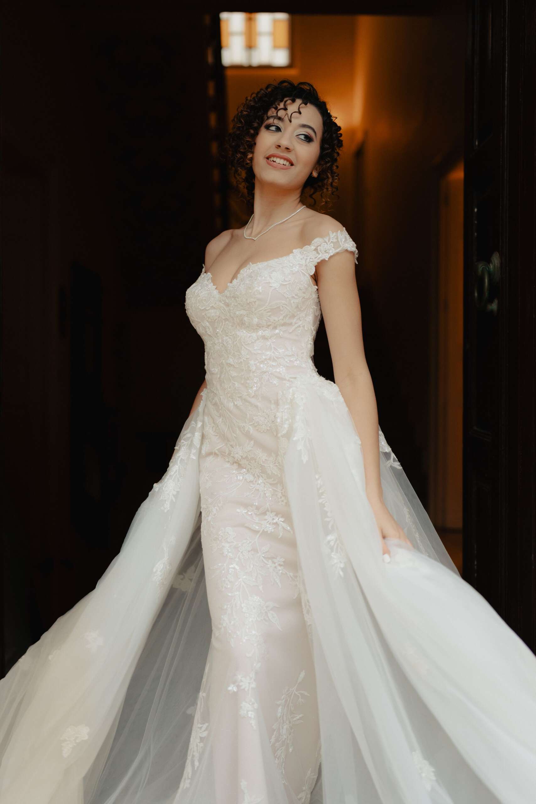
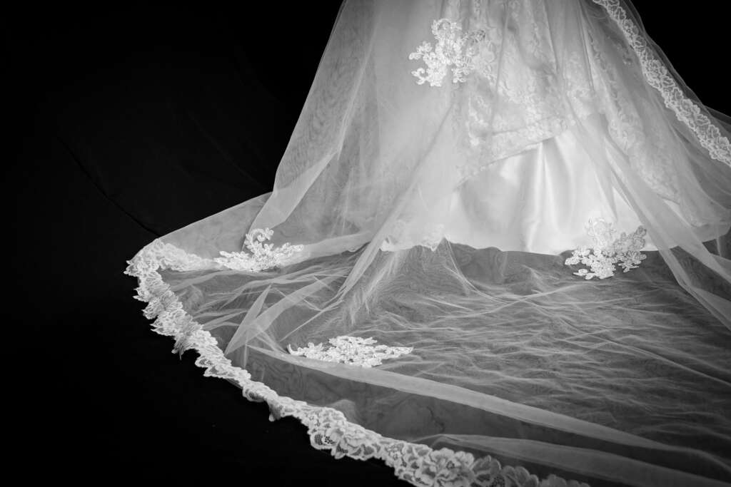
A couture look can fill a screen and still conceal its most interesting decision. The eye arrives at the silhouette, the color or the sweep of a train. It takes longer to notice where a surface becomes quiet. This editorial proposes a slower way of looking: begin with the space between the embellishments.
Close-up viewing does not reveal everything about construction. A photograph cannot tell us how many hours a piece required, whether a material feels soft, or who completed a particular operation. It can, however, help us describe what is actually visible with more precision. That is a useful alternative to calling every spectacular dress a masterpiece and leaving the reader there.
Begin where the decoration stops
Imagine a dark sleeve scattered with reflective elements. The densest area attracts attention first. Now look at the point where the elements thin out. Does the spacing change gradually, or does the decorated field end in a firm boundary? Is the remaining fabric smooth, folded or transparent?
These questions turn sparkle into composition. The unadorned section gives the eye a place to rest and makes the concentrated detail readable. A caption might describe a cluster breaking into isolated points across the sleeve. It should not invent the technique or material if that information has not been provided.
Follow one edge
An edge is where an object meets the surrounding air. Trace a collar, cuff or hem. A narrow, firm outline has a different visual effect from a loose feathered one. A folded border can make a soft surface appear deliberate; an irregular finish can interrupt an otherwise controlled shape.
For a picture sequence, pair a full-length frame with a detail that explains this relationship. The close-up should add information. Three crops of the same glittering area may offer less insight than one view showing how that area meets the plain garment beneath it.
Let scale remain visible
A detail photographed without context can become an abstract landscape. That can be beautiful, but readers may not know whether they are seeing a collar or a skirt. Keep a seam, fastening or recognizable part of the silhouette in one frame. The sequence can then move between abstraction and orientation without losing its subject.
Scale also changes language. A tiny repeated mark might look delicate at a distance and forceful when enlarged. Describe the relationship rather than treating one interpretation as the garment’s only meaning.
End with the whole look again
Return to the first photograph after studying the details. The overall shape may now feel different. A small dark interval can organize a bright surface. A restrained neckline can hold an elaborate skirt in balance. Opulence becomes more interesting when it includes decisions about where to stop.
The point is not to prove that quiet design is superior to exuberant design. It is to give both enough attention to be understood. A good couture image invites wonder. A thoughtful edit gives that wonder something specific to look at.
Questions about reading couture imagery
Can a photograph prove that a garment is handmade?
No. Describe the visible details and use verified credits or information from the fashion house for claims about methods and makers.
What makes a useful couture detail photograph?
A detail is useful when it reveals a relationship the full-length image cannot show clearly, such as the transition between a decorated surface and a plain edge.
Explore more
A Train After the Turn: Couture as a Conversation With Space
Browse Couture for more from LEGACIQ.