BEAUTY
Matte Beside Shine: The Beauty Detail You Notice Before the Color
Explore matte and glossy beauty textures through contrast, placement and lighting, with a practical approach to building an intentional visual effect.
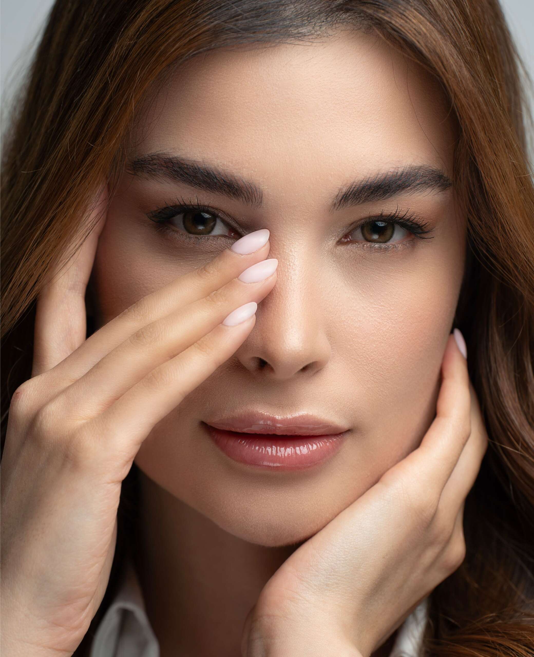
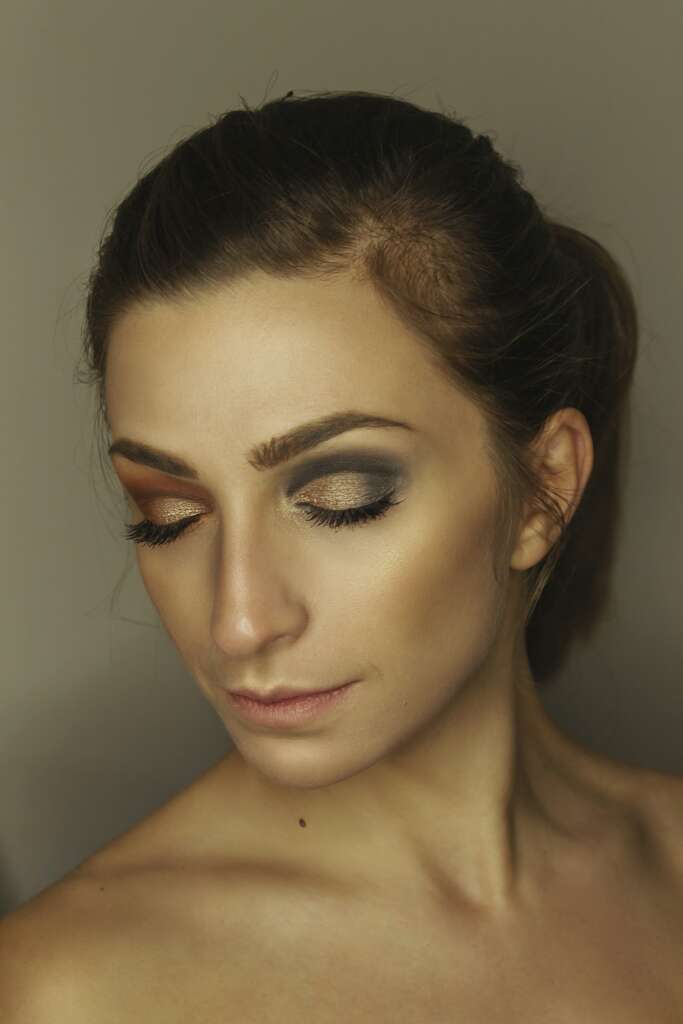
Beauty texture can shape an image before the viewer identifies its exact color. A reflective area catches light differently from a matte one, creating a contrast that can guide attention. To explore that contrast, choose where you want reflection and consider what surrounds it.
This feature treats finish as a visual decision. It does not rank natural skin textures or suggest that a face should look uniformly smooth. Matte, satin and glossy effects can all be expressive, and the result depends on placement, lighting and the rest of the look.
Begin with the material relationship
Think of a dark satin ribbon beside a plain cotton shirt. Even when the colors are close, the surfaces read differently. A beauty look can use a similar relationship: a more reflective lip beside a softer surrounding finish, or a luminous detail framed by a matte accessory.
The comparison is about appearance, not product substitution. Materials suitable for clothing or craft are not automatically safe for use on the face. Use products intended for the area where you apply them and follow their directions. The visual reference can guide the idea without becoming a literal ingredient.
Choose one area for the strongest reflection
If everything reflects strongly, the eye may read an overall effect rather than a distinct accent. That can be beautiful, but it is different from using a small reflective area as punctuation. Decide which version interests you before adding several highlights.
Consider a look built around a reflective lip. The rest of the styling might use quieter fabrics and fewer bright accessories, letting the lip remain the clearest point of contrast. Alternatively, a reflective earring could repeat the effect and turn a single accent into a pair. Neither arrangement is inherently better; they produce different rhythms.
Watch how the light changes the result
A finish that appears subtle in one position can become prominent when the face turns. For a photograph, test the actual light and angle instead of relying on the appearance at a dressing table. A short sequence of still images can reveal where the reflection appears and disappears.
Do not treat that variation as a defect that must always be corrected. A changing reflection can make the image feel responsive and dimensional. The practical question is whether it supports the intended focal point or repeatedly obscures a detail you want the viewer to see.
Let natural texture remain part of the image
A close-up contains more information than a small screen preview. Lines, pores and fine hair may become visible, along with product texture. Their presence does not mean the beauty look has failed. Consider whether the image communicates the idea before making every natural feature an editing target.
If the photograph is retouched, be clear within the team about what the edit is meant to accomplish. Removing a distracting temporary mark is a different choice from reshaping features or replacing the appearance of skin. Agreeing on the purpose helps avoid an automatic march toward a uniform surface.
Connect the finish to clothing and hair
A matte garment can give a reflective beauty detail a quieter setting. A glossy hair shape can become the main texture statement, with makeup playing a supporting role. Jewelry adds another reflective material, sometimes more visually forceful than the face itself.
Review the complete frame. A beauty concept can become clearer through a change outside the makeup: turning a necklace, removing an unnecessary accessory or choosing a less reflective backdrop. Those decisions often preserve the original idea more effectively than repeatedly altering the face.
Edit by comparison
Create two versions that differ in one respect. Keep the color similar and change the finish, or keep the finish and change its placement. Compare the images at the size where they will appear. A detail designed for a close-up may be nearly invisible in a full portrait.
Name the difference in plain language. One version draws attention to the mouth; the other distributes light across the face. This makes the decision easier to discuss with a collaborator and easier to repeat later without depending on vague approval.
Give the image a useful caption
Name the relationship the viewer can observe: a reflective lip set against softer surrounding textures, for example. This adds more information than a string of product adjectives. If the team supplied verified product credits, keep them accurate and separate from your visual interpretation. A caption can explain the creative choice without claiming that the photograph demonstrates a benefit beyond the appearance of the finished look.
Questions about beauty finishes
Is matte makeup always more understated?
No. A dark or sharply defined matte area can be visually prominent. Contrast depends on color, shape and context as well as reflectivity.
Does a glossy finish require heavy application?
Not necessarily. Follow the product’s intended use and assess the visible result. More product is not automatically a clearer or more comfortable effect.
Can matte and glossy textures work in the same look?
Yes. Their difference can be the central idea. Choose whether you want one texture to dominate or several areas to share the attention, then review the complete styling together.
Explore more
The Beauty Look Has a Point of View: Choose What the Eye Notices First
Browse Beauty for more from LEGACIQ.