


MAKEUP
The Eyeliner Does Not Need a Twin: Designing an Intentional Asymmetric Look
Explore an asymmetric eyeliner look through shared color, controlled differences and a clear focal point, without treating facial symmetry as a requirement.
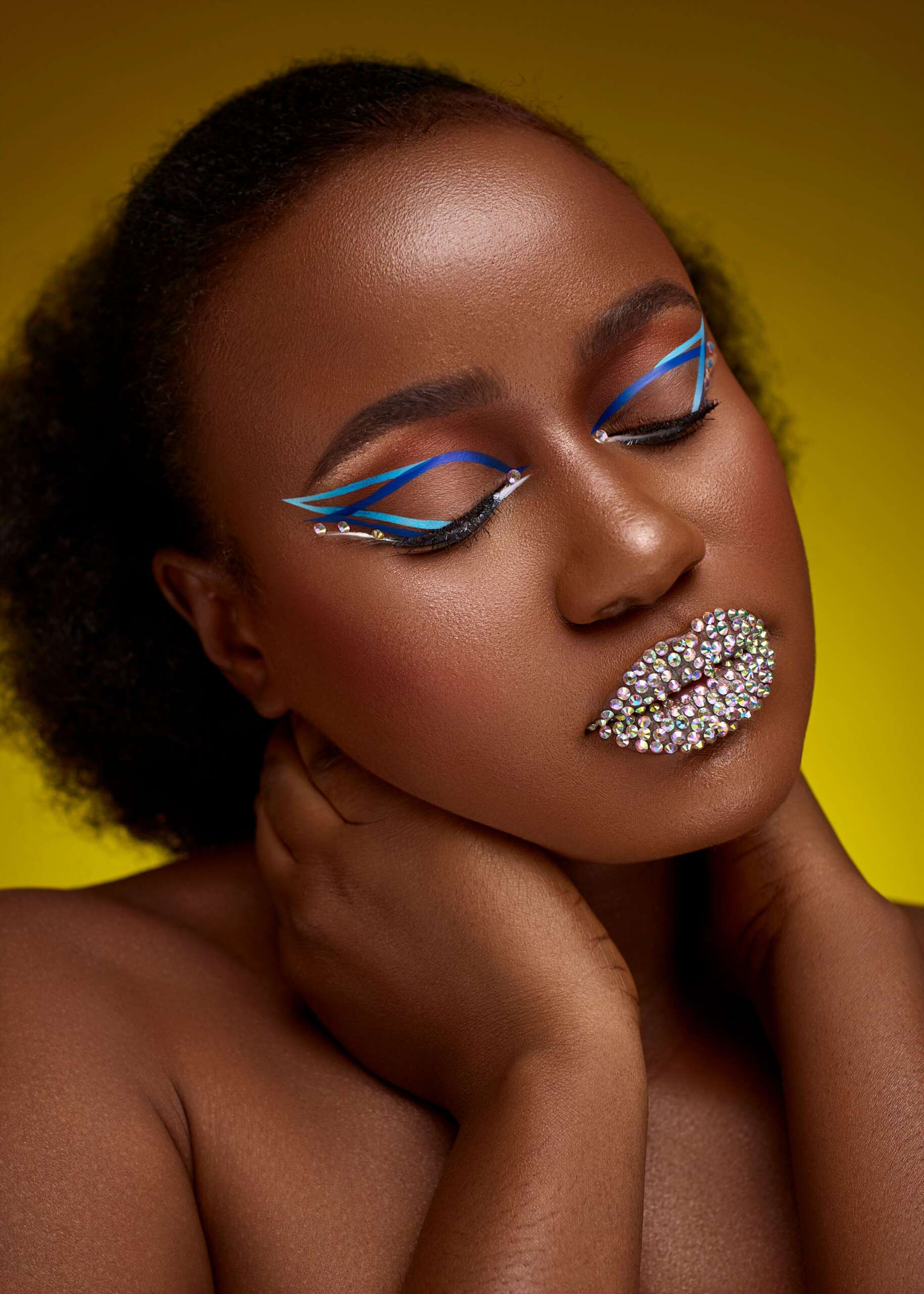
An asymmetric eyeliner look uses an intentional difference between the two eyes while keeping another element consistent. You might repeat the color but change the length of a line, or keep the same shape while placing it differently. The aim is a readable design choice, not a test of how closely one side can imitate the other.
Faces already have differences. This styling exercise does not treat them as mistakes. It offers a way to make a graphic idea out of variation, with the wearer deciding how subtle or noticeable the result should be.
Choose the shared element first
A shared color can make two different marks feel related. So can a repeated direction or a similar thickness. Choose one point of continuity before deciding how the sides will differ. That gives the look a foundation and makes the variation easier to assess.
For example, one side could carry a short line while the other extends farther outward, both in the same shade. Or a repeated small mark could appear in a different position on each side. These are visual possibilities rather than instructions to apply a product outside its approved use. Use an eye product as directed and keep the application comfortable.
Make the difference large enough to read as a choice
A tiny accidental-looking discrepancy may not communicate the concept you intended. If the purpose is visible asymmetry, compare the look from conversational distance. Can you identify the difference without studying it closely? If not, decide whether you want a more pronounced variation or a quieter effect that is mainly for you.
There is no obligation to make an experimental look dramatic. The key is understanding your own intention. A private detail can be satisfying even when it does not become the first thing another person notices.
Let the rest of the face set the volume
The same eye design can feel different beside a strong lip, a restrained lip or a bright accessory. Decide whether the asymmetry is the central idea or one part of a fuller composition. Keeping other contrasts quieter may make the eye design easier to read, but it is not a requirement.
If you add another prominent feature, give it a relationship to the eye. A repeated color can connect them. A contrasting shape can create deliberate tension. Review the whole look before deciding that the asymmetry itself is the source of any visual confusion.
Test expression and movement
A graphic line changes when the eyes open, close or look in another direction. Check the look in the expressions you expect to use rather than only in a fixed mirror pose. For a photograph, test the intended angle as well as a front-facing view.
The design may be most visible in one position and less visible in another. That does not automatically mean it needs correction. A changing detail can be part of the effect. The practical question is whether the look behaves in a way you enjoy and whether it supports the image you are making.
Edit one side without chasing perfect balance
Once you have chosen asymmetry, it is easy to keep adjusting until both sides gradually become alike. Return to the original rule: which element is shared, and which is deliberately different? Assess the design against that rule rather than an automatic expectation of matching.
If one line becomes much heavier than intended, you can revise the concept instead of treating the session as a failure. Perhaps the heavier mark becomes the focal point and the other remains a small echo. Adaptation can produce a more interesting result than repeated attempts to recover the first sketch.
Record the idea clearly
A photograph and a short note can help you repeat the look. Name the shared feature and the variation: same color, different length; same mark, different placement. Product names alone will not capture those decisions.
For an editorial team, include the intended camera angle and any important continuity notes. If the look changes during the shoot, record the final version accurately. The published credits should describe what was actually used and who created it, rather than a planned version that never reached the frame.
Questions about asymmetric makeup
Does asymmetric eyeliner only work in editorial photography?
No. The scale of the difference can be adapted to your preference. A subtle variation may feel comfortable for everyday wear, while a stronger graphic version may suit a particular creative project.
Should the brows also be made asymmetric?
There is no need. Choose which feature carries the idea and assess the rest of the look around it. Adding more differences can either support or compete with the original concept.
What if the two sides do not look deliberately different?
Clarify the shared element and the contrast. You can make the variation more noticeable, simplify competing details or keep it as a small personal experiment without requiring an obvious statement.
Explore more
A Color Echo, Not a Full Match: Repeating One Shade Across a Makeup Look
Browse Makeup for more from LEGACIQ.


